I’m going to let you in on a secret: there is no copy and paste formula for making good landing pages.

K.I.S.S. the Page
If you’ve read any other article on landing pages you’ll have heard about keeping it simple and avoiding being stupid. The unfortunate thing is that this needs to be drilled into the head of any digital marketers embarking on the journey.
You have but a split second to capture the attention of those arriving on your website, so don’t write War and Peace; but don’t fall into the false sense of security that lies within character and word counts. Sure, you might have managed to fall under 300 words…although your formatting might not make it look like that.
|
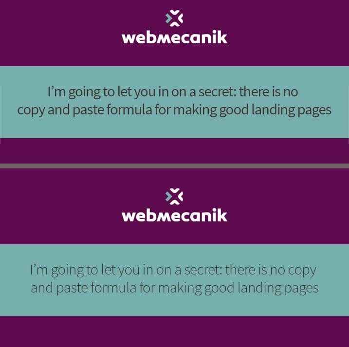
You don’t need to be a graphic designer to see the difference between the top and bottom example, although you do need to A/B test to establish which is better. Too often we let our personal bias get in the way and assume our likes and dislikes apply to everyone. The same tactic needs to apply to web forms used for data capture. Any more than two or three fields, on first glance, appears intimidating; especially if you’re asking for valuable information such as an email address and phone number. To keep on track with visually appealing landing pages many digital marketers add images galore, text kits, and scripts with cool-looking share buttons. One of the downsides of this being page load times. Perhaps when trialling the pages on an enterprise connection this doesn’t seem so bad, but do not assume that everyone accessing the page will load it as fast. |
Get Engaged
For some time now digital marketing experts have been screaming about the engagement rates video content achieves. A really good start at how this works for general digital strategies has been written by Rebecca at @PurpleDogUK here.
Exodus Analytics (@exodusanalytics) delved deeper into video in relation to landing pages, and pointed out that video use can increase conversion rates by up to 80%! This statistic alone should have you with the camcorder out right now.
Along the way, entice people by establishing genuine and reputable testimonials. “Webmecanik are the best marketing automation company we could have chosen” might be truthfully said (it definitely is ;)) by past clients but when written the testimonial sounds fake; and when it comes from Bob’s-SME-Nobody-Knows Co. there’s less legitimacy. Essentially, unless you’re working with Coca Cola consider avoiding testimonials altogether.
Now, Disregard Everything You Have Just Read
As I mentioned earlier, there are no hard and fast rules for landing pages. Don’t get me wrong, some great guides exist, such as @SearchDecoder’s here, but almost everything anyone will ever recommend can be chopped and changed for different results.
@Webmecanik_EN @SearchDecoder Essential! Only if you have enough traffic. Too small an audience = pointless. Glad you enjoyed the piece! ???
— Sam Hurley ➤➤➤➤➤➤➤➤➤ (@Sam___Hurley) August 3, 2016
This is perhaps one of the many reasons why digital influencer and CEO of DigitEyez, @Sam__Hurley, holds A/B testing landing pages as an essential. Of course, ensure that you keep his disclaimer for sufficient traffic in mind although it is possible in some cases to run A/B tests with low traffic.
If you want to be able to detect large conversion rate differences, e.g. if a page converts 100% more than the other (which isn't too likely by the way), you can get away with a lesser audience. For the smaller differences in conversion rates that tend to be more standard when optimising landing pages, you will definitely require a larger audience for the results to be statistically significant. You can find a useful calculator here to input your current conversion rate, the difference you'd like to be able to detect, and then be given the minimum visitor count for your data to be useful.
If you do have the traffic, and your landing page or marketing automation software offers A/B testing, you have tools at your disposal to prove most of the above wrong.
Keeping it simple? Some cases exist where complicated is better (e.g. two-step web forms). Including videos? Some have found more success without them, perhaps due to loading time, how content is viewed (e.g. not wanting to use up mobile data loading a video), or a simple preference to text based pages. The only way one can establish which is best is to A/B test.
@Sam___Hurley @Webmecanik_EN make sure you robot.txt and block user ugent = googlebot from the test page, I've seen clients hurt on SEO
— Matthew Capala (@SearchDecoder) August 3, 2016
@Sam___Hurley @Webmecanik_EN when Google crawls multiple test pages
— Matthew Capala (@SearchDecoder) August 3, 2016
That said, don't be reckless and heed the advice of Alphametic CEO and SearchDecoder brainbox Matthew Capala above. DO NOT UNDO ALL THE HARD WORK ON SEO. Make sure you’ve blocked Google’s web crawlers from indexing your test pages through a robot.txt file on the root of your website (find out more here). Otherwise, your rankings are going to be severely hurt.
So now with all of this in mind, go forth and break most of the rules (not Matthew’s – that is non-negotiable). You might end up getting some really surprising results, and if you do, share them with us! Tweet @Webmecanik_EN or email me on jbe AT www.webmecanik.com.


